Everything You Need to Know About Sherwin Williams Sea Salt
Today I wanted to talk a bit about an increasingly popular color and one that I would recommend myself, and that is Sherwin Williams Sea Salt (SW 6204). Sea Salt is an incredibly reliable color that I have been seeing pop up in more and more homes.
So, for anyone who isn’t already aware of its strengths, let’s go over some of the key features that you should understand about Sherwin Williams Sea Salt.

What color is Sea Salt Sherwin Williams?
Sherwin Williams Sea Salt is a very popular neutral color choice. It is a great option for anyone who wants a more subtle greenish-gray color, and who enjoys cool tones. The Sherwin Williams Sea Salt Palette includes grays, light greens, and blues.
Is Sherwin Williams Sea Salt green or blue?
Sherwin Williams Sea Salt registers as a green color. It is a little muted thanks to its gray and blue undertones, but it will often present as a green color.
Now there are a few times when Sea Salt may pop with a little more of the blue undertone. In very specific lighting conditions, you may feel that it appears as a very slight baby blue. This is easily avoided though if you pay attention to your lighting choices, and understand the context of the room you are painting it in. Avoiding cooler lighting, like that in North-facing rooms is a good way to avoid the blue undertones flashing in Sea Salt.
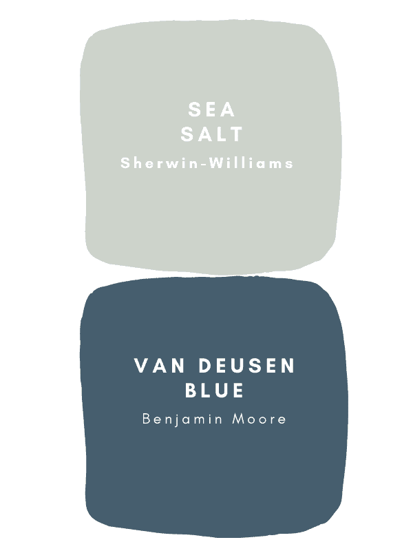
Is Sherwin Williams Sea Salt warm or cool?
Sherwin Williams is a more cool color. This is thanks to the gray and blue undertones it contains. If you are looking for a warmer green, you will want something with more yellow or beige undertones.
What accent colors go with Sherwin Williams Sea Salt?
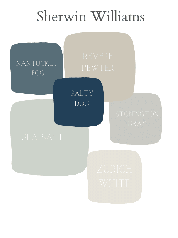
Sea Salt is a muted color on its own and will pair well with other neutrals. Sherwin Williams themselves recommend several of their colors that pair well with Sea Salt.
Fleur de Sel (SW 7666), Summit Gray (SW 7669), and Spare White (SW 6203) are the popular Sea Salt color combinations that Sherwin Williams recommends. You’ll notice that these colors offer gray undertones and compliment the colors in Sea Salt well.
When should I use SW Sea Salt?
With the low-key appearance of Sea Salt, I think that it is best used in areas where you are looking to provide a calm and relaxing atmosphere. It isn’t a warm neutral, so it isn’t the liveliest of colors, but its cool tones can go a long way to provide a sense of relaxation.
It also isn’t a bright or cool white, so you won’t get a feeling of a sterile environment or something squeaky clean. A Sherwin Williams Sea Salt living room is a popular choice for people wanting to make the most of this color. Or as a fun pop of color for your front door.

What are the best trim and ceiling colors to pair with SW Sea Salt?
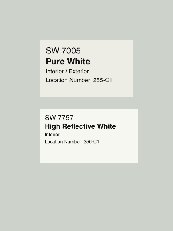
You will want to pair Sea Salt with white colors for your ceiling and trim. What exact whites to choose will depend on your décor and personal preference, as it can work well with cool or warm white colors.
Creamier whites with greige undertones are a good choice, and crisp cool whites with more blue undertones work great as well. Some ways to determine the right choice for you is to look at the other décor and tones around your house. If you already have a lot of cream and warm tones around, then a warmer white right may be the right decision.
My two favorite’s are Pure white and high reflective white by Sherwin Williams
How does it look in darker spaces?
In darker spaces, Sea Salt will tend to lean lighter and present more of its green tones. Sea Salt may also appear a bit warmer in darker rooms, so you should understand what your lighting conditions will be when you are painting.
What is the closest Benjamin Moore Paint Color to SW Sea Salt?
Before we cover what a close match to Sherwin Williams Sea Salt is for Benjamin Moore, I want to point out something that you should avoid. Benjamin Moore has their own paint color that is named Sea Salt and they should not be used interchangeably.
If you must use Benjamin Moore paint and you are looking for a close match to Sherwin Williams Sea Salt, then Gray Cashmere (2138-60) is probably your closest match. Wickham Gray (HC-171) is another option that is a bit warmer but could be considered a reasonable option. Still, I always advise that you avoid color matching and go with the original company’s formula, but I understand that there are cases where a contractor will need to use a specific brand.

What color is close to Sea Salt?
If you are looking for other Sherwin Williams colors that are close to Sea Salt, then you do have many options that exist in that color range. Sherwin Williams suggests colors like Sea
Spray (SW 9651), Pine Frost (SW 9656), Pearl Gray (SW 0052), and Moorstone (SW 9630) as just a few colors that are similar to Sea Salt.
If you want to look elsewhere for a color like Sea Salt, you will be looking for a greenish-gray color, with blue undertones.
What is one shade lighter than Sherwin Williams Sea Salt?
Sherwin Williams Sea Salt is already a quite light color, so determining exactly what is a shade lighter is a bit difficult. For my best estimate, a similar color that is perhaps just a shade lighter than Sea Salt would be Pine Frost (SW 9656). It still has very subtle green tones but is overall a bit lighter than Sea Salt.
One of the Sherwin Williams Sea Salt coordinating colors that comes highly recommended is Fleur De Sel (SW 7666), which also appears a bit lighter than Sea Salt. However, this color has fewer green tones than Sea Salt and may appear greyer because of this.
You also have the option to adjust the colors of your paints. So Sherwin Williams Sea Salt lightened 50 percent may be a good option if you want a lighter shade of Sea Salt.
Does Sea Salt go with Alabaster?
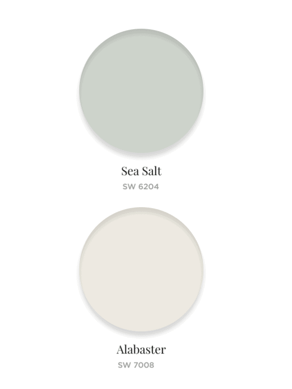
I mentioned before how many different white colors would be good accents and great ceiling and trim colors for Sea Salt. Alabaster (SW 7008) is absolutely one of these!
It is a warmer creamier white, so you should consider that when understanding how it will look with the rest of your room, but it is one of the many options that will pair nicely with Sea Salt.
What white goes with Sherwin Williams Sea Salt?
We just covered Alabaster as a particular white that goes well with Sea Salt, but Sherwin Williams has some other offerings that work great as well.
Fleur De Sel (SW 7666) is technically white, and Sherwin Williams highly recommends this color to pair with Sea Salt. Extra White (SW 7006), Greek Villa (SW 7551), and Westhighland White (SW 7566) are some other white colors that can complement Sea Salt well.
Many more Sherwin Williams white colors will pair well, and I recommend that you grab some samples and do some tests, and even something I haven’t recommended may look perfect for you.
Sea Salt Undertones
The undertones in Sea Salt are mostly gray and blue and provide a cool tone towards this greenish-gray color.
What type of home does Sea Salt Work in?
Sea Salt is one of Sherwin Williams most popular colors, and this is because it is versatile enough to work in many different types of homes. Its calming properties and appearance are great reasons to apply it to many different areas of your home.
That being said, the color is called Sea Salt, so for a beach style or themed home, Sea Salt may be a great choice to tie the concept together.
Best Rooms to Paint Sea Salt
While Sea Salt is a strong neutral color that can be applied in any room, there are some situations where you may want to use it more than others.
Many people like to provide a feeling of sterility and cleanliness in their bathrooms, and so white is a popular color choice there. Sea Salt doesn’t fit too well in this category, so it may be a less popular choice for bathrooms.
A Sherwin Williams Sea Salt bedroom is a great idea for picking an area where Sea Salt can work its magic. Another possibility is a Sherwin Williams Sea Salt kitchen, which is a popular choice for those with homes with lighter counters and cabinets.
Overall, for areas like bedrooms, family rooms, and even dining rooms, where a sense of calm and tranquility is a desirable quality, Sea Salt works great here. Its cool tones and subtle color provide just a hint of liveliness that can make a living space feel very inviting.

How to pick the perfect paint color?
Perfection will mean something different for everyone, and so my advice for picking the perfect paint color is always to sit down and take the time to consider what your goals for your home are. What is your taste like, what does the décor in your home look like?
The perfect paint color will be the one that suits your taste the best, so you should consider what pairs well with your style and with the furniture you have chosen. If you like vibrance and eccentric colors, then you may want strong colors that pop and liven up any room in your home.
If your home environment is calmer and more muted, and you like to create an atmosphere of rest and relaxation, then choosing more muted colors and lighter tones may work the best for
you. Try to get as many samples as you can for the colors that intrigue you and try to move throughout your home and see how these colors feel.
Sea Salt vs. Rainwashed
If you are deciding between Rainwashed (SW 6211) and Sea Salt, then your decision will ultimately be based on how much green you want from your paint. These are both very beautiful greenish-grey colors; the key difference is that the green tones in Rainwashed pop a lot more than in Sea Salt.
Conclusion
If you are looking for a cool greenish-gray paint color to add to your home, then I think that Sherwin Williams Sea Salt will be one of your strongest options. It is a subtle color that can work well with a lot of trims and provide a nice sense of comfort to any space.
If you would like to check out my thoughts on other paint colors and design ideas for your home, then explore the rest of my blog, I wish you the best of luck with your home painting projects and I hope this guide has offered you some help on your journey to finding the perfect paint color.
Pin me!!!
Chat soon!
Kori

I am moving into a home that has grey floors, not my favorite but we can’t change them for a while. I have Sea salt in my home now and love it. Do you think it will go with grey floors and cream furniture?
Your article helped me a lot, is there any more related content? Thanks!