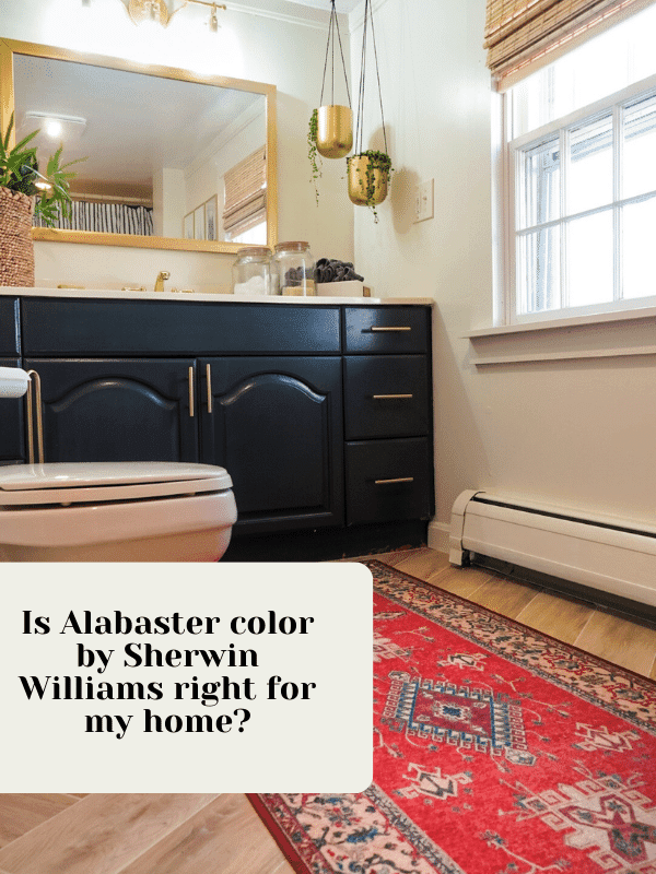
Is Alabaster color by Sherwin Williams right for my home?
Painting even a small section of your home can be an extensive project, so you want to make sure that your choice of color is one that you will be happy with for at least a little while.
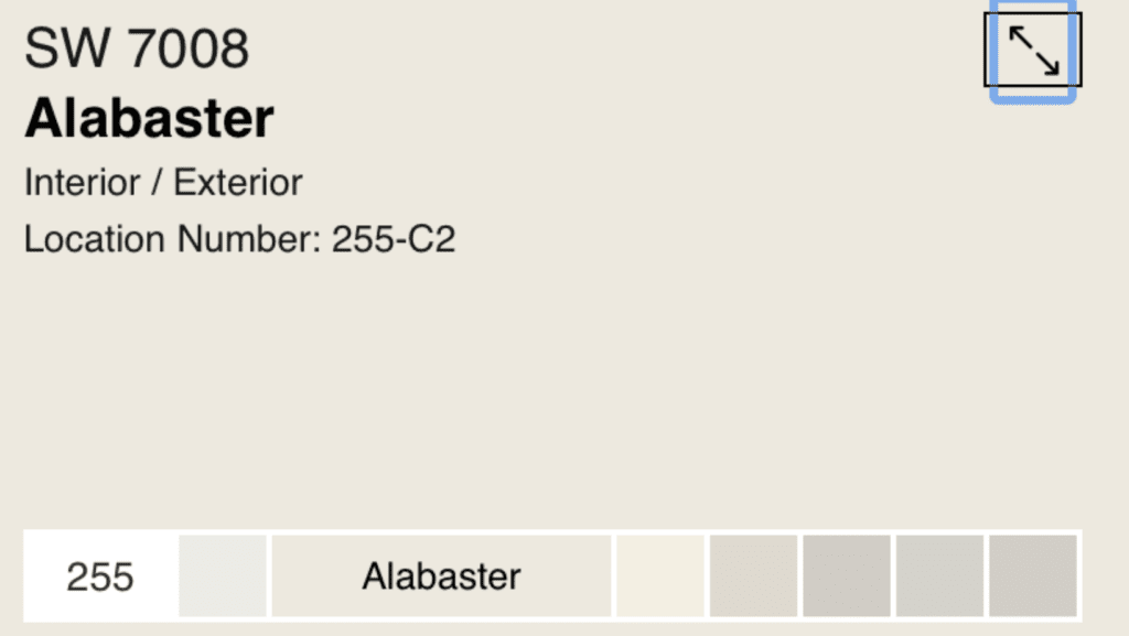
Alabaster (SW 7008) by Sherwin Williams is a color that has been consistently popular and was even Sherwin Williams Color of the Year in 2016!
But is this color still a great choice and is it the right one for you? Let’s talk about it!
Is alabaster white or beige?
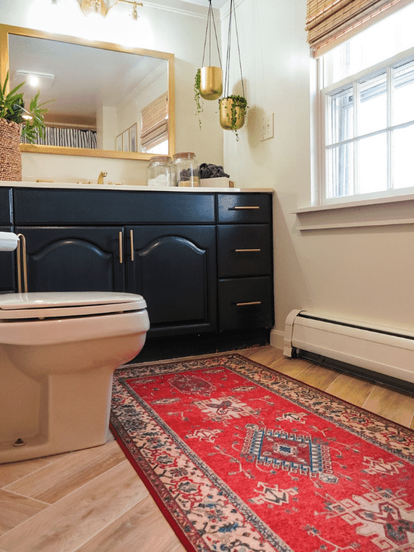
I would best describe alabaster color as a warm white. It has yellow undertones that clearly set it apart from cooler white paint choices.
This warmth provided by yellow undertones can sometimes have people describe it as a beige or greige color, but cream or creamy white is a better description.
So, if you’re looking for a pure crisp and cool white color, alabaster should not be your first choice. If you are looking for a true beige, then alabaster would not work there either.
Alabaster is a strong choice if you are looking for a warmer white to compliment the colors in your home. You can even grab an alabaster color strip and compare it to current furniture and other décor in your home.
Is alabaster gray or beige?
Alabaster is neither gray nor beige and is closer to an off-white.
Next to a purer cooler white, alabaster will appear a bit creamier, but it will stand out against any gray or beige colors.
Alabaster features yellow undertones and a neutral base, which makes it warmer than a truer cooler white, and yet not as dark as a grey or beige.
If you are looking for a gray or beige color for your paint project, then alabaster will not work well for you. While it may be paired with these colors (greige paints are a nice compliment) alabaster is best used when a white paint color is desired.
What colors go good with alabaster?
Sherwin Williams has offered input on what colors they suggest go well with alabaster. According to them, “light blushes or grays…” pair well with alabaster.
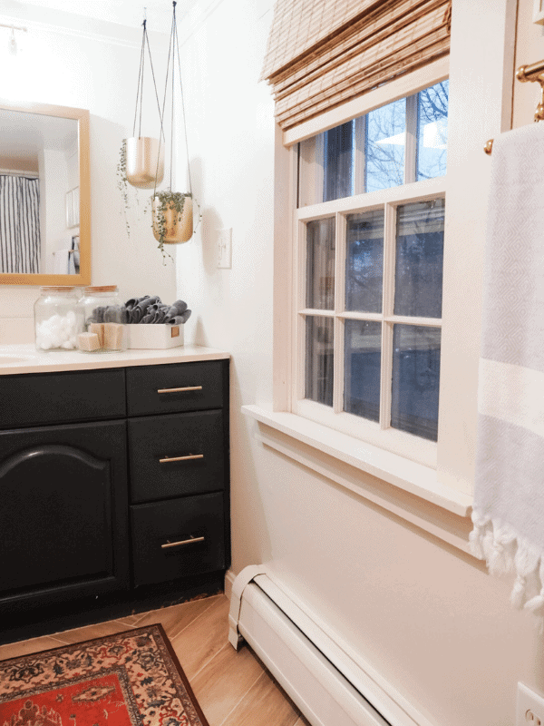
They also suggest that this combination can be used to bridge transitional and traditional styles in your home. Otherwise, they suggest contrasting alabaster with darker colors like their Urbane Bronze (SW 7048) or Gray Area (SW 7052).
The alabaster color palette can be incredibly extensive because of its neutral base and warm appearance. You can pair it with darker colors to really make it crisp. You can also pair it next to light colors to provide warmth and coziness to any room.
What color is a shade darker than Alabaster?
If you’re looking for a shade darker than Alabaster (remember the alabaster color code is SW 7008), then Westhighland White (SW 7566) will be your best bet.
Westhighland White may be a shade darker, but it still won’t qualify as a grey or even a beige. It mostly just provides even more of an off-white feel with the neutral tones of Alabaster.
If you are looking for more warm gray undertones, Westhighland White is probably a good choice over alabaster. Westhighland White has more warm gray undertones over the warm yellow and beige undertones of alabaster, while still desiring a nice neutral white for your paint project.

What are the undertones in Alabaster?
The undertones featured in Alabaster are a bit yellow and some beige/greige. These undertones are why at first glance some people might feel this color is beige or even grey.
However, when you compare it with true white or grey and beige colors, the bright white of the paint comes through.
The undertones in Alabaster are what provide it a nice warm feeling and creamy appearance. The undertones here are also why alabaster is sometimes described as off-white. It isn’t warm or dark enough to be considered grey or beige, but it isn’t as crisp or cool as a true white.
The yellow and beige undertones of alabaster are probably what has caused it to be so popular and have so much staying power. It offers a warm neutral tone that can appear as a brighter white with the right accents, or a warmer neutral.
Does alabaster white look yellow?
While alabaster white does have yellow undertones, it should not appear yellow when applied in your home.
As with all paint, lighting and the environment can affect how paint colors appear, so consider where in your home the color is placed and do some test paints first. With very yellow artificial lighting, or if your room is consistently coated in bright yellow light from the sun, then the yellow undertones of alabaster may become more prominent.
The flooring or other objects in the room with the alabaster color may also contribute to making the alabaster look more yellow. However, if your lighting is consistent with less of a yellowish hue, then alabaster white should not be seen as a yellow color.

Does alabaster look green?
With the yellow and beige undertones, alabaster should not appear as green in any context.
While lighting can affect how colors appear, alabaster does not have the base or undertones that should cause a green appearance.
If you have seen a claimed alabaster color appear green, then you should check to see if it is the right mix, from the right company (maybe they were using an alabaster color Benjamin Moore offers, instead of the alabaster color Sherwin Williams offers) or if other environmental factors could have caused some green hue to be cast on the alabaster paint.
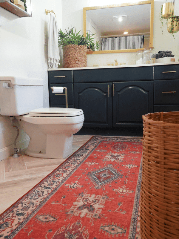
Is white in style for home décor right now?
While all-white interiors may be beginning to fall out of style, white paired with other vibrant and interesting colors is still a popular option.
Alabaster white was even celebrated as Sherwin Williams’ 2016 Color of the Year. It has been a few years since this, but it remains a popular choice because of its versatility.
You may not want to completely coat the inside of your house with alabaster white, but it can definitely play a role in complementing other warm colors and offering a cozier alternative to cooler truer white colors.
Neutrals are also still quite popular, and the yellow and beige undertones of alabaster have it categorized into the off-white territory. This means it can still be included with the popularity of neutrals.
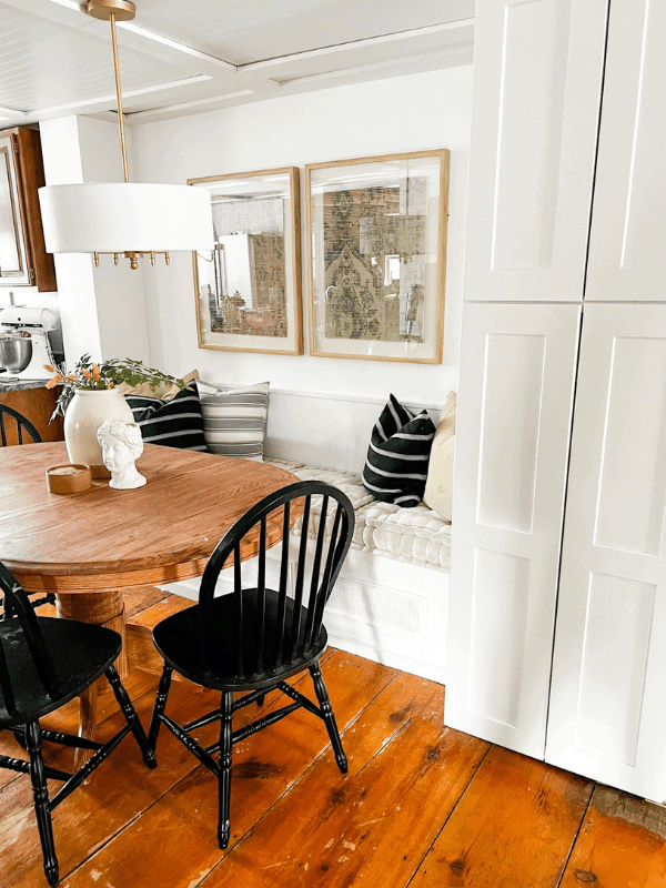
Alabaster Vs. Extra White
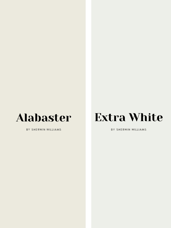
Extra White (SW 7006) will stand out as a purer brighter white when compared with alabaster. The yellow and beige undertones really pop when placed next to extra white and the strength of its neutrals really comes through.
So, if you’re looking for a purer cooler white, Extra White may be your ideal option. However, alabaster is definitely a strong choice even if you are looking for a white that can still provide a cozy feel. If you’re wondering “what color ceiling works best with alabaster walls?”, then Extra White could work there too!
Painting a whole room with alabaster white will still have it appear as a brighter white. It is only when it is paired with a cooler white like Extra white that it begins to appear more off-white.
Alabaster Vs. Greek Villa
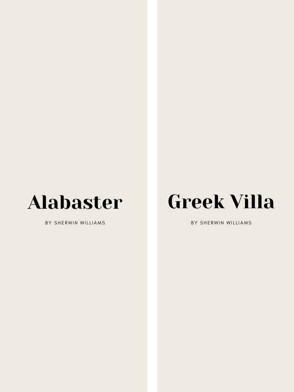
Greek Villa (SW 7551) is another white color that can compete with alabaster for similar projects. It can often look like alabaster, but on close inspection, Greek Villa will have more yellow undertones and may appear warmer and creamier.
Alabaster, compared to Greek villa, has more grey undertones. The competition between these two colors will have to be decided in the context of the room. Both can be used when a white color is desired, or when you are looking for a warm white.
The difference will come as to how warm you want the room to appear, and what colors/themes you will pair them with.
Can you use Alabaster Walls with Pure White Trim?
Alabaster can be a flexible color, so it can be paired with quite a few options. Choosing Pure White (SW 7005) for the trim is a great option and especially if you want to provide some contrast but avoid anything too drastic.
Pure White is more of a true white and features cooler tones, which can provide a nice contrast to alabaster. It does have fewer blue undertones than other white color options though which might make it one of the better options to pair with alabaster.
If the trim paired with alabaster walls is too cool of a white, the warmth of the alabaster may make the cool undertones of the trim pop too much. It may even come across as blue or even more of a grey.
Where to start: painting 101
If you have chosen your color and are ready to start painting, then here are a few tips on getting started with your project.
Before you begin a full painting project, explore the different paint options you like, try small paint samples and consider the room and lighting it will appear in. Once you feel you have found the right paint choice, then prepare for your project.
- Remove all furniture and inspect walls and other surfaces that will be painted and remove imperfections for a smooth surface.
- Clean all surfaces and ensure there is proper ventilation in the room where you will be painting. (Also wear older clothes so that you do not get paint on your wardrobe)
- Use painters’ tape to section off areas and prevent paint from bleeding over into other areas. You can start with painting trim since it is easier, then move on to the ceiling and walls.
- Before painting, prime your ceiling and walls. (It is important to note that many brands do offer paint and primer in one)
- If you do use a primer by itself, sand the primer before beginning to paint.
- After this, just clean up and after your paint is dry you should be done!
Consider Your Options and Have Fun!
While painting your home is an involved project, you should not stress yourself out too much over your choices. Try to enjoy that process of finding that new right color for your home and don’t be scared of grabbing sample paints and doing as many tests as you need to find the right color for you.
So whether you choose alabaster or have considered one of the other paint options I suggested, best of luck with your project and I hope you find your dream color!
Be sure to pin for later!
Want to shop the items in this post? *These links are affiliate links and if used I make a small commission at no cost to you. Thanks for supporting the brands that support this blog of mine!
Thanks for reading along!
Chat soon,
Kori
